One Calendar to Rule Them All

Most booking calendars are broken
Here’s a common experience: you manage four properties. You open your booking calendar. It shows you one property at a time. To see all four, you click through tabs, or open four browser windows, or squint at a tiny sidebar.
This is how most booking software handles calendars. One property. One view. Scroll left for the past, scroll right for the future. Bookings stacked on top of each other until nothing is readable.
It’s 2026. We can do better.
Four views, one calendar
Airflow’s calendar gives you four distinct ways to look at your bookings, all accessible from the same page. Switch between them with a single click. Every view shows every resource. No tabs, no windows, no guessing.
Day view — the detail lens
Day view shows you everything happening on a single date. Arrivals, departures, in-progress stays, gaps. It’s the view you use when a guest calls and asks “is Thursday available?” or when you need to see exactly what’s happening at check-in time.
Each resource gets its own row. Bookings appear as coloured bars with guest names, dates, and status visible at a glance. Nothing overlaps. Nothing hides.
Week view — the operational workhorse
Week view is where most users spend their time, and for good reason. It shows seven days across all your resources in a swim-lane layout. Every booking gets its own horizontal row within its resource, so even if you have three overlapping bookings on a single property (think: a departure, a same-day turnaround, and a new arrival), each one is clearly visible.
This is the view that answers “what does my week look like?” in two seconds. It’s also the default view on mobile, because it strikes the right balance between detail and overview on smaller screens.
Month view — the full picture
Month view gives you the traditional calendar grid, but with a twist: booking bars span across days, colour-coded by resource. You can see at a glance where your gaps are, which weekends are fully booked, and where cancellations have opened up availability.
It’s the view you use for planning — deciding when to block dates for maintenance, spotting slow periods that need a pricing adjustment, or just getting a sense of the overall rhythm of your business.
Year view — the heatmap
Year view is the one nobody else offers. It compresses the entire year into a heatmap grid — 365 days, colour-coded by occupancy. Dark cells mean high occupancy. Light cells mean gaps. You can instantly see seasonal patterns, identify your strongest months, and spot the dead zones.

No other booking calendar shows you a full year of data this cleanly. It’s not a view you use daily, but when you need the big picture — for investor updates, annual planning, or just curiosity — nothing else comes close.
The swim-lane algorithm
Most calendars handle overlapping bookings by stacking them vertically, which creates a mess. Three bookings on the same day? Three layers of tiny rectangles, with text cut off and colours bleeding together.
Airflow uses a swim-lane layout algorithm. Each booking gets its own horizontal lane within its resource row. The algorithm calculates the minimum number of lanes needed to show all bookings without overlap, then assigns each booking to a lane.
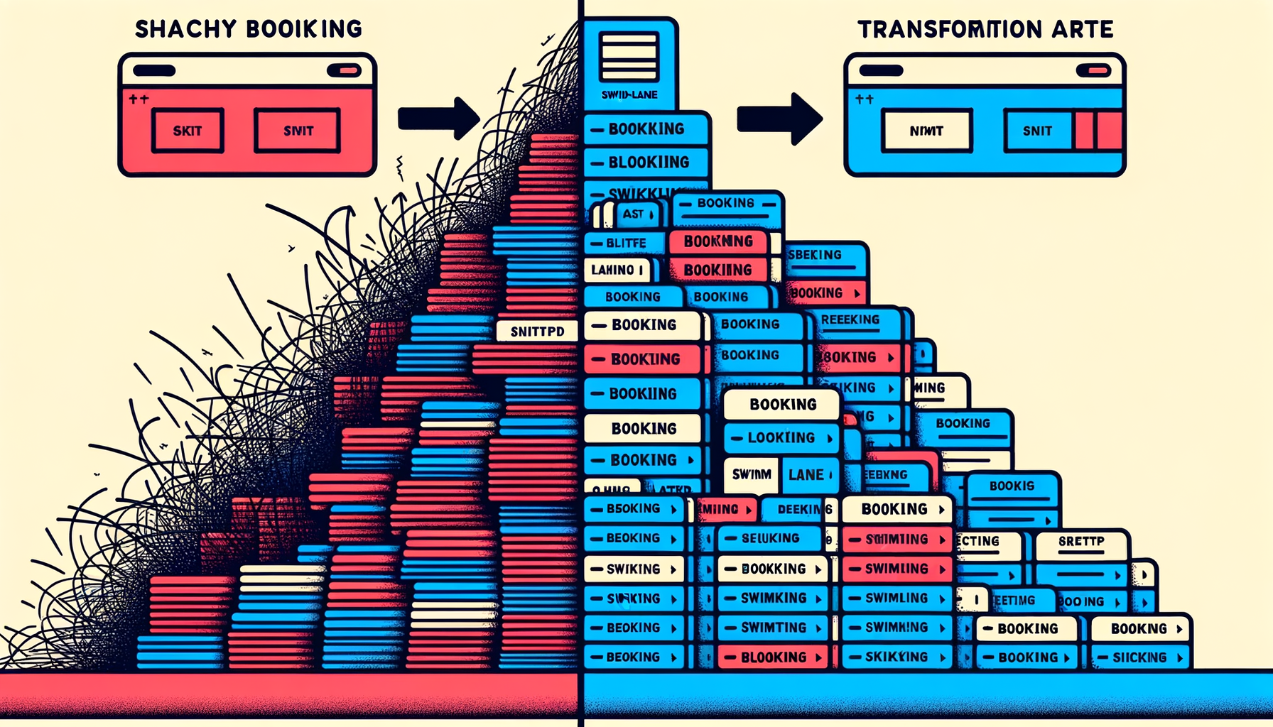
The result: bookings never cover each other. You never miss a booking because it’s hiding behind another one. Even during your busiest week, every booking is visible, readable, and clickable.
Multi-resource visibility
The calendar shows all your resources simultaneously, with each resource identifiable by a colour-coded bar. You control which resources are visible — toggle them on or off depending on what you need to see.
Managing ten properties but only care about the three in Barcelona right now? Toggle off the rest. Checking availability across your entire portfolio? Toggle them all on.
The colour coding is consistent across every view. If your beach house is blue in day view, it’s blue in year view. No relearning, no legend-checking.
Interactive by default
The calendar isn’t just a display — it’s a navigation tool.
- Click any booking to jump directly to its detail page. See the full guest record, financial summary, notes, and status without searching.
- Click any date to switch to the day view for that date. Spotted something interesting in month view? One click to zoom in.
- Today button snaps you back to the current date from wherever you’ve scrolled. It’s a small thing, but when you’ve been browsing November and need to get back to today, it matters.
Built for mobile
Booking businesses don’t sit at desks all day. You’re at the property, on the boat, at the salon chair. The calendar needs to work on a phone.
Airflow’s calendar is mobile-first, not mobile-adapted. That’s an important distinction. We didn’t shrink the desktop calendar to fit a phone screen. We designed the mobile experience separately.

On mobile:
- Week view is the default — it gives the best information density for a small screen
- Swipe navigation — swipe left and right to move between time periods, no tiny arrows to tap
- Enlarged booking bars — touch targets are bigger on mobile, so you can actually tap the booking you want
- Simplified grid — the background grid is less dense, keeping the focus on your bookings
The design philosophy
We made a deliberate decision with the calendar’s visual design: the data is the star.
The grid lines are subtle. The date numbers are faded. The background is clean and neutral. All the visual emphasis goes to the booking bars themselves — bold colours, clear text, high contrast against the background.
This isn’t an aesthetic choice. It’s a functional one. When you glance at the calendar, your eye should go to the bookings, not the chrome around them. The busier your calendar gets, the more this matters. A cluttered UI on top of a busy schedule is unusable. A clean UI on top of a busy schedule is still readable.
See it yourself
The calendar is the centre of your Airflow portal. Every plan includes it. Every resource you add appears on it automatically.
If you’re managing multiple bookable resources and your current calendar makes you open three tabs to see what’s happening, try Airflow. Or see how the whole system works before you sign up.
One calendar. Four views. Every booking. No tab-switching required.